 |
| Rescue Beauty Lounge in IKB:2012 |
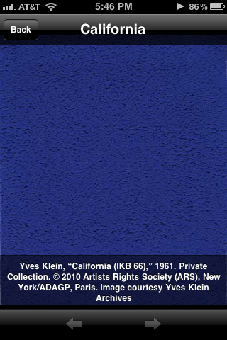
Okay, I kept stalling this post because I could NOT get these pictures to turn up color accurate. Even with different lighting conditions. Even with white balance. Even with photo editing. At. All. Basically, if you want to see color-accurate swatches, scroll to the bottom of the post, where I've linked to bloggers with gorgeous pictures. See a comparison to other blues from Wikipedia (IKB is third row from the top, fourth from the right at the bottom of the page). See a comparison of IKB:2012 to other polishes from Scrangie.
This is going to be a bit of a long post. I'm going to tackle the formula/application first, and then talk a bit about Yves Klein.
The Formula
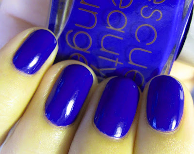
The first thing you need to know is that I love Yves Klein. I'm also a fan of RBL - the product, not the brand, if you can understand that. So I was very excited for this polish. I heard the rumors of the bad application, but Ji had assured people that the formula would be fixed for the true release. I have been a big fan and supporter of RBL, but recently there have been a few changes that I don't particularly like. The first is the price increase, which I can say is understandable, but still not something I'm jumping for joy over. The second is the move to extremely limited-edition collections that are not restocked. This seriously seriously annoys me. Even Chanel's most coveted polishes are on sale for weeks, not a few days. I understand that RBL is a smaller, independent brand, and I understand that it increases profits in the short term, but I don't like that model of sales. It's why I'm not a huge fan of MAC. The thing that has held me through these changes with RBL is the colors and the formula. The formula of most RBL polishes, particularly the cremes, is amazing (minus Underwear). The colors are often unique. You can tell Ji loves color and fashion and polish. The color of Rescue Beauty Lounge in IKB:2012 is gorgeous. It is very true to International Klein Blue, which you can see by the photograph above, which compares it to Klein's Untitled Blue Monochrome (IKB 108), as printed in the gallery guide to the "Yves Klein: With the Void, Full Powers" exhibition - although that is still not color-accurate even after photo editing. So I love the color of this polish. I would wear it every other manicure if the formula worked. The formula is the worst. formula. I have ever used from what I would consider a "prestige" brand. I guess I was a bit cocky hearing about the poor application, thinking it wouldn't be much trouble for me. It was, I must reiterate, the worst. I can't say I regret buying this polish because I love IKB, but I am extremely unhappy with it's application. I swatched it on a nail stick before wearing it and immediately thinned it with thinner. I am going to try thinning it again after wearing it this first time, but I don't know how it will help. The formula is just weird. I would actually recommend not applying thin coats, like I usually do, because it goes on patchy, and if you try to fix the patchiness, it makes more bald spots. I would recommend two coats: one thick coat, and one medium-thick coat. The formula is just totally bizarre, like the polish is sticking to itself, like when rubber cement starts to dry and you rub on it and it balls up. But this formula is even stickier and thicker than rubber cement. It's stringy, and gets stringy in about 5 seconds, so you have to work fast. If you do thicker coats, it will bubble, but it's not noticeable unless you're within a foot of the polish. If you don't do a thick coat, it will look like this (in my experience):

 |
| One thin coat of RBL in IKB:2012. This is as thin as I could get it with the formula. It's patchy and stringy. |
 |
| The formula is stringy. This is after wiping the brush on the rim to remove excess polish 5 seconds after removing the brush from the polish. |
Here's how it looks with a thicker coat:
 |
| It's still a bit patchy, and there are bubbles (which are minimized with Seche Vite and not noticeable at greater than 1 foot away), but it's smoother and a second coat, plus Seche Vite smooths it out. |
So basically that's my warning to you. This is a gorgeous color, but a bear to work with. If you can find it (it's sold out, of course), make sure it's worth it to you before you buy or swap something valuable. I would be unhappy if I didn't have it. But I'm not exactly happy with it. I will wear it again because I love the color, but probably one-third of the reason I buy RBL polishes is the expectation that the formula will be spot-on. This betrays that implied contract with the consumer IMO. Sorry to sound so negative. I knew going in that the formula would probably not be good; it's likely many other people didn't.
The Swatches
These are posted in pairs, the top photograph being un-retouched, and the second one color-corrected. My skin looks odd and it still doesn't hit the exact color, but it's better. These also don't show off the jelliness of the polish. It's more jelly in real life.
 |
| Rescue Beauty Lounge in IKB:2012 |
 |
| Rescue Beauty Lounge in IKB:2012 |
 |
| Rescue Beauty Lounge in IKB:2012 |
The following are pictures with my gallery guide from the "Yves Klein: With the Void, Full Powers" exhibit at the Walker Art Center. The nail polish is not retouched in these pictures and is a bit more color-accurate. This was co-mounted with the Smithsonian's Hirshhorn Museum and Sculpture Garden. It was an incredible exhibit. If you would like to explore it further, I really recommend the
book or the
app. I don't have the book, but I really recommend the app if you're interested. It's great even if you didn't see the exhibition.
|
|
Yves Klein and his monochrome paintings
|
|
Yves Klein pictured in his photograph, Le Saut dans le vide [Leap into the Void]
Rescue Beauty Lounge in IKB:2012 is from the Spring 2012 "Fan Collection" and is sold out. Worn from May 7-10, 2012.
|
|
Yves Klein
 |
| Pure IKB pigment (even this is not accurate; see exhibit photograph below for true color) |
 |
| Yves Klein, Table Bleue. I would really love to own this. |
 |
| From the Walker Art Center's exhibit, "Yves Klein: With the Void, Full Powers" |
The picture above shows my favorite piece from the exhibit: the pure IKB pigment laid bare. Paravent (IKB 62) is in the pigment; Klein explained this piece: "The folding screens make it possible to be enveloped by the blue." Everything in this exhibit is uncovered. We went the last week of the exhibit; there were museum workers posted in each room and they were so jumpy. Apparently some people had fallen forward into the monochromes, entranced, and some people had tried to grab some of the pigment! Despite the horror of imagining these pieces marred, I'm so glad they staged the exhibit this way. It really allowed you to feel the power of Yves Klein's work fully, which is just as I imagine he would have wished it.
The creation of International Klein Blue does not at all encompass everything that Klein did throughout his short life, but it is what he has become most famous for. I love Yves Klein because you can tell he was crazy. Cra-zy. He was wildly inspired and passionate and had insane ideas and thoughts about the world, but he was sincere. He wasn't pretentious; he was simply a man searching for how to express things that were inexpressible in life, how to learn and achieve things deemed impossible, how to leap into the void. Klein sought to express the "immaterial," what he called, “a transcendent realm of total freedom where one might exist without the burden of objects, immersed in pure aesthetic sensibility.” Klein felt that paintings could not depict that freedom of the immaterial – by their very nature they were capturing ideas and putting them down, imprisoning them, on canvas. To Klein, his pigment, a blue so deep and at the same time so bright and luminous that it almost defies explanation, was the encapsulation of freedom, the “spirit and sensibility that the color of the sky and sea alone can produce” (Crosby 3). Pigment was a truly free artistic expression of these ideas. It could be used for anything: totally infinite possibilities.
A few pictures from the app:
Learn more about Yves Klein from
Wikipedia, Youtube (
here and
here). See more of his work from the online
archives or a Google Image Search for
monochromes and
other work. More about the creation of
Le saut dans le vide from
Wikipedia.
See color accurate swatches from Scrangie, Kellie at Also Known As..., and Sam at Fashion Polish. There are other swatches out there, but these are the most color accurate I have seen.
Information quoted in this post are taken from a paper I wrote, as well as the Walker Art Center's "Yves Klein: With the Void: Full Powers" gallery guide and app (Crosby, Eric. Yves Klein: With the Void, Full Powers. Walker Art Center, Minneapolis, Minnesota: Walker Art Center, 2010. Print.) A few other sources I've found helpful:
- Cabeen, Catherine. “Why Yves Klein.” On the Boards. On the Boards. 4 Apr. 2011. Web. 8 Nov. 2011.
- Morisset, Vanessa. “Yves Klein: Body, Colour, Immaterial.” CentrePompidou.fr. Centre Pompidou, Nov. 2006. Web. 8 Nov. 2011.
- Weitemeier, Hannah. Yves Klein: 1928-1962, International Klein Blue. Köln, Germany: Taschen, 2001. Print.
If you've made it through this I'm impressed (and thanks)! So did you buy IKB:2012? What do you think of it? How do you feel about Rescue Beauty Lounge?


WlanceXliago Ian Parra https://wakelet.com/wake/irIyyh0a3Znp4flOmKxBt
ReplyDeletetalnerssandsund
MtiamaWbist_go_Warren Andrew Allen CorelDRAW
ReplyDeleteAutodesk Maya
Cracked
meconrappwadd
Ycredfragflucfu-1981 Megan Edwardz Best
ReplyDeleteDownload Free
neuturwehrru