 |
| Flash |
Happy holiday weekend! I'm back to school on Wednesday, so things might slow down a bit here, but I don't want that to happen, so I'll do my best!
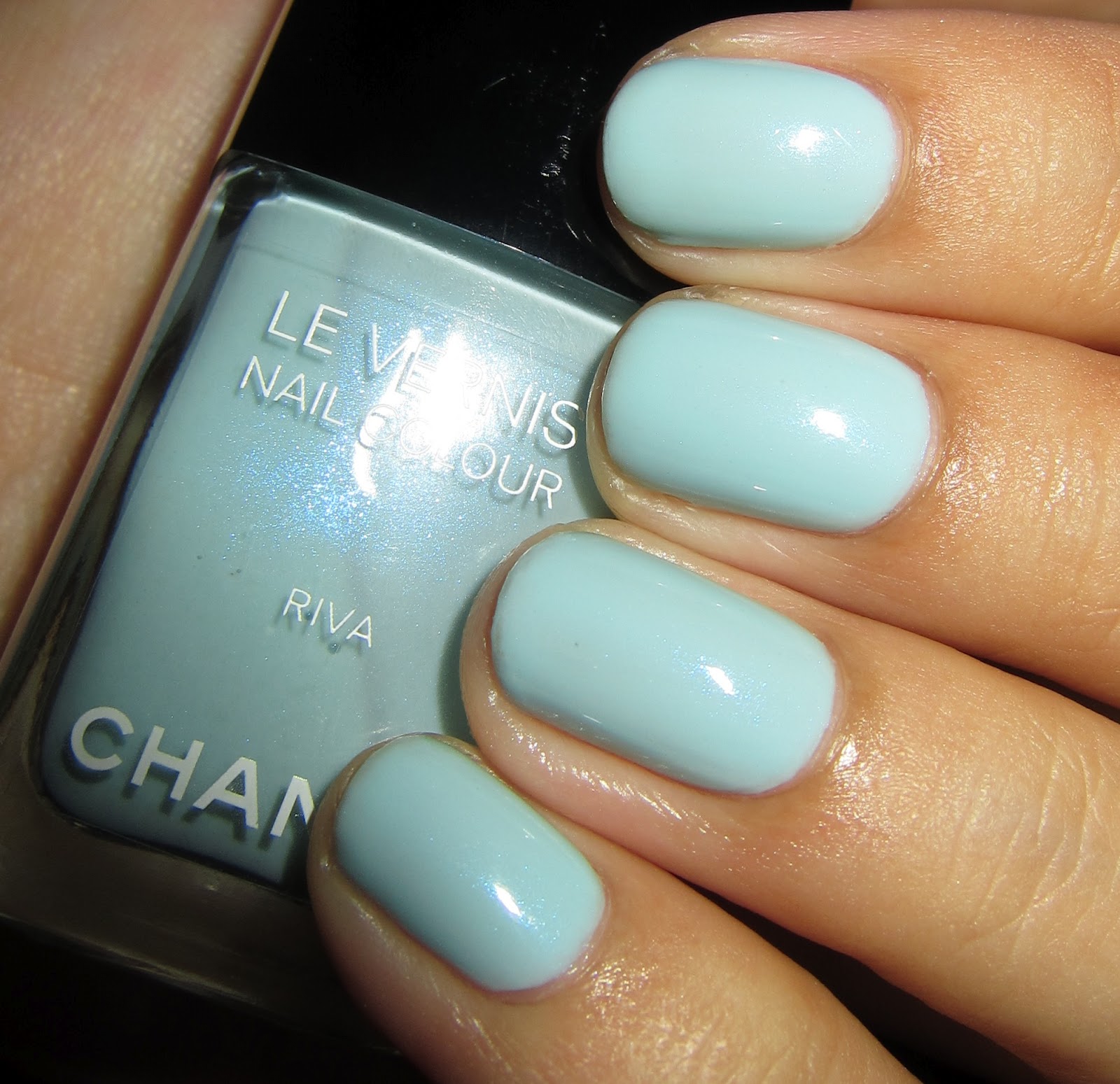
This mani is Chanel in Riva, which was released with the Cruise 2010-2011 "
Côte d'Azur" collection. This was expected to be the successor to #407 Jade, but it never really reached that status because of disappointed expectations. I still really like it despite its flaws.
Riva is a
celeste velato blue (I know,
fan-cy, but Wikipedia tells me so!), a delicate pastel blue that has a yellow undertone - although not so much that it will clash with cooler skin tones. It has an extremely subtle blue shimmer in a sheer creme base. It's definitely the most hidden of Chanel shimmers, nearing the level of the Dior cremes that have the absolutely useless shimmer in the bottle that never shows up on the nail. The shimmer in Riva can only be seen in direct sunlight when you're looking for it. If you click to enlarge my photos you can see it, but obviously from a distance it's nonexistent. What makes Riva special though is that it is pastel, but it never looks chalky or stark. This would be a beautiful "something blue" wedding polish, if you're so inclined.
However, the delicacy of the polish is also one of the downsides: to do achieve it, they made the formula sheer, so it looks
extremely streaky at anything less than 3 coats. It's also a little watery and not self-leveling. I did 2 thin coats of Riva and 1 coat of Seche Vite, which I let dry for an hour. I then added another medium-thin coat of Riva and a top coat of Seche Vite. If I hadn't done the SV sandwich, I am positive it would have needed 4 coats to even out the color. My best suggestion is to really splay out your brush as far as you can in the middle of the nail to get the most coverage on the first stroke.
By the way, thank goodness for this polish ending my streak of frustrating picture-taking! Sorry that there's a bit of ugliness at the tip of my ring finger. These pictures are after only 1 day of wear, but the night before I took them I was dancing like the business and got
slightly pushed into a wall, so the polish wore off a bit there (that sounds kind of weird, but it wasn't!). Worn August 31 - September 2, 2012.
 |
| Direct sunlight - sunset |
 |
| Direct sunlight |
 |
| Indirect natural light |
 |
| Direct sunlight |
 |
| Direct sunlight - sunset |
 |
| Flash |
 |
| Flash |
 |
| Flash |
 |
| Flash |
 |
| Flash |
Riva is unique in my collection, but there are similar polishes. From pictures I've seen, Revlon in #092 Blue Lagoon is similar, but not a dupe.
 |
| Left to right: Chanel in Coco Blue, Sinful Colors in Cinderella, Illamasqua in Caress, Rescue Beauty Lounge in Bikini Bottom, Chanel in Riva, Essie in #683 Sag Harbor, China Glaze in Sea Spray |
Chanel in Coco Blue is included for color reference, but it's clearly nothing like Riva. Sinful Colors in Cinderella is a darker jelly and has red/gold flakey shimmer. Illamasqua in Caress is pretty similar (and has a better formula), but because the formula is more opaque, it comes across much starker and less delicate on the nail than Riva. Caress is a creme, has more white than Riva, and is neutral rather than yellow-leaning. Rescue Beauty Lounge in Square Pants is a little more similar than these pictures indicate (the black under the desk makes it look a bit darker than it is). It is a sheer jelly with no shimmer and is a little darker and leans more yellow than Riva. Square Pants over Caress might come up in the same color family as Riva, but without the shimmer. Essie in #683 Sag Harbor is darker and has a tiny bit less yellow than Riva; it's a greyed out blue with white-silver shimmer. China Glaze in Sea Spray is also less yellow than Riva (more so than Sag Harbor) and has a lot more grey in the base than Sag Harbor, but it's a similar polish - a greyed out blue with white-silver shimmer.
After a couple days, I decided I wanted to bring out the shimmer in Riva, so I grabbed Chanel in #465 Azur. Azur was released with the Spring 2008 "Aurora Blues" collection. It is meant to be used as a layering polish and has small flakie shimmers in blue and teal, as well as fine shimmers in purple, blue, and teal. Over lighter colors, it's a subtle, but noticeable effect. Over darker colors it shines. On my ring finger, for comparison, I used CND Effects in #561 Sapphire Sparkle.
 |
| Direct sunlight |
 |
| Indirect natural light |
 |
| Natural light |
Sapphire Sparkle is basically a more obvious, less complex version of Azur. It has only one type of shimmer in a clear base, a medium flakie with a blue, teal, and violet shift. I think the CND Effects are nice, but for this effect, when I wanted to keep things delicate, it doesn't work for me. The Effects do always tend to look like you layered something over a color, rather than seemingly melding in with the base color as Azur does. If you want a blingier effect, go with Sapphire Sparkle, but I like the more natural effect Azur gave me. Worn September 2 - 3, 2012.
I will also note that I have a problem with the new CND bottles. I bought 8 of the new CND polishes right after they relaunched in 2009. I played with the Effects on a swatch wheel and then put them away,
lids tightly closed. The handles on the new CND bottles are soft rubber - even softer than the Orly handles (which I really like, although they're not the most aesthetically pleasing). They do not form a complete seal. Sapphire Sparkle has experienced evaporation of about 1/8 of the bottle. 6 of my other Effects have experienced evaporation of about 1/4 of the bottle. #556 Copper Shimmer and #530 Desert Suede have experienced evaporation of over 1/2 of the bottle. Now this isn't a
horrendous deal; I can just add thinner and bring the bottles back up to full. However,
this issue should have been addressed in the 3 years since the launch and as far as I know, it has not. I asked on the Nail Board a while back, and this is a common problem. Therefore, I don't plan on buying any more CND polishes with these new bottles. If you see a CND polish you really like and you don't want to be horrified by the amount of evaporation you'll get, I would suggest you decant your polishes into different bottles. On the plus side, the new CND polishes dry just fine, unlike with the old formula (which I loved color-wise), and the brushes are similar to the OPI Pro-Wide brush, just a little skinnier.
Other pictures of Riva can be found here:
Lacquerized swatch and comparisons, The Beauty Look Book swatch and comparisons (
1,
2) and
pedicure, All Lacquered Up swatch and comparisons (
1,
2),
Vampy Varnish swatch,
Temptalia swatch,
Café Makeup swatch,
Adventures of a Mad Scientist swatch,
Polish Police bottle comparisons,
The Swatchaholic swatch, and Makeup and Beauty Blog
swatch and
comparison.
Azur is beautiful worn as a sheer, which you can see on Audreyeleven's
Flickr. It also looks beautiful layered over dark blues (it was released with #461 Blue Satin), which you can see on
Cosmetic Habit. Chanel released a similar polish with the Fall 2009 "Tokyo Happening" collection, #387 Blue Wish. From everything I've seen, Blue Wish has larger flakie particles and they are more of a blue-leaning silver. Azur is more complex and subtle and is clearly blue no matter what you top it with. You can see comparison photos from
The Beauty Look Book and Babyness's Flickr (
Azur,
Blue Wish).
So is the shimmer in Riva too subtle for you? Do you like it better with a topper? What's your favorite delicate blue?


Searching swatches for my all time top lemming Riva. You did such a great job with this post I'm dying for this <3
ReplyDelete