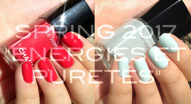
Chanel in #552 Resplendissant & #584 Bleu Pastel Swatches + Comparisons | Spring 2017 Le Blanc "Énergies et Puretés" Collection
Here is the final Spring collection from Chanel, "Énergies et Puretés" ("Energy and Purity"). This is the Le Blanc collection and is only available on Chanel.com right now. I believe that the Le Blanc collection is usually included in Nordstrom's Anniversary Sale, but I don't often shop there, so I'm not positive.
The copy for this collection says:
"Energy and purity. Tradition and modernity. Inspired by the harmony of opposites, a new makeup collection unveils soft and subtle shades with hints of vibrancy. The unexpected contrast of muted tones and cheery brights offers an array of fresh, luminous looks."
Once again (as seems to be a common thread with these Lucia Pica collections), the look of the makeup collection is really beautiful, but the nails get fairly standard shades. I mean, are you surprised that this collection includes a red?
 |
| Direct sunlight |
 |
| Indirect natural light |
#552 Resplendissant ("Resplendent," "Shining") is a bright coral red creme. The formula was slightly thick for my preference, but I had no problems manipulating it, I just prefer formulas on the thin side. This is definitely a one-coater for most people, but I used 2 thin coats for that more gel-like look on the nail. This isn't a type of red that I prefer on me, but I can't deny that it's a beautiful, classic polish. This one is limited-edition.
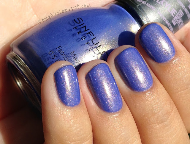
I included some pinks, corals, and reds for comparison. Misa in #264 Bop Til You Drop (subtle shimmer) is a coral pink with subtle gold and pink shimmer; it's lighter, less orange, and more pink than Resplendissant. Chanel in #549 Distraction (subtle shimmer) is a pinky coral with subtle pink pearl; it's lighter and more pink. Essie in #839 Sunday Funday (shimmer) is a pinky coral with silver fleck shimmer; it's lighter and bit more pink. Rescue Beauty Lounge in Coral (crelly) is lighter and more pink. Chanel in #647 Lilis (creme) is a bright orange coral; it's more orange. OPI in My Chihuahua Bites! (creme) is a bit lighter and more pink. Chanel in #605 Tapage (creme) is darker and more red. OPI in Red My Fortune Cookie (creme) is also darker and more red. Below is an overexposed picture to help accentuate the differences.
 |
| Not color accurate |
 |
| Direct sunlight |
 |
| Indirect natural light |
#584 Bleu Pastel has gotten a bit of buzz because it's reminiscent of Chanel in Riva (I have them compared below). This one is an addition to the permanent line. It's a warm-leaning blue pastel creme. Its not quite a crelly, but it does have a slightly less opaque formula, so the polish doesn't come off as chalky or stark on the nail. I used 2 thin coats and 1 medium coat, being careful to float my brush on the last coat. So, this one also has that hidden shimmer we last saw in #570 Androgyne. I honestly thought this was a creme until I was checking my photos for color-accuracy at night and used my phone's flashlight function to look at the bottle. This blue shimmer is basically undetectable on the nail, and only visible in the bottle under extremely bright lighting conditions. Historically, I have usually loved Chanel's subtle shimmers, but these hidden shimmers that are becoming more frequent are just aggravating, and such a missed opportunity. The only reason I can think of adding them is that they possibly help the formula?
 |
| Indoors, night - flash |
Riva is an example of Chanel's subtle shimmer done right. It has a deeper, warmer base, and cool-toned blue subtle shimmer.
Illamasqua in Caress (creme) is deeper than Bleu Pastel. China Glaze in Dashboard Dreamer (subtle shimmer) is deeper and has subtle pink, copper, and gold shimmer. Chanel in Riva (subtle shimmer) is deeper with more green and a cool-toned blue subtle shimmer. Chanel in Coco Blue (shimmer) was not showing up color-accurate next to these lighter blues (I have it swatched here). It has less green, is much deeper, and has white pearl and blue subtle shimmer.
So again we have a collection where I like the colors, but I'm not excited by them. What do you think? What do you want to see from Chanel for the rest of the year? I can tell you that for summer we have more hidden shimmer.


I read an article by a nailpolish manufacturer that answered your question about the subtle shimmer that disappears on the nail. The reason they do that is so that when the polish dries it has a subtle lit-from-within look to it, rather than a dull flat cream.
ReplyDelete