
Chanel in #528 Rouge Puissant & #530 Rouge Radical Swatches + Comparisons | Fall 2016 "Le Rouge Collection No. 1" Collection

The Fall 2016 "Le Rouge Collection No 1" marks the first collection with Chanel's new Global Creative Makeup and Colour Designer, Lucia Pica. Previously, Chanel Beauty was led by Creative Director Peter Philips, and since his departure for Dior in 2013, the collections haven't had a specified director. Of her debut collection, Pica says, "Red is a pillar color for Chanel. So, it sort of made sense for me to start somewhere very familiar and very important for the brand. Really what I wanted to do was to explore the meaning of a color, and what's behind this color. How does this color make you feel, and how does this color make you think? And, I thought that an interesting way of showing this would be to show my process of inspiration. Because it was about one color, I decided to make a book and a video with a collective of people that I have a relationship with and that [sic] really understand my vision. This collection is very much about the power of femininity, and its strength, its vulnerability, its sensuality. Me, I'm a woman, and I'm talking to women by creating this collection, so I wanted to do something that represents what women are in terms of color. Mademoiselle Chanel used to say, 'Put your red lipstick on and attack!' which I find very inspiring as a woman." You can see a bit more from this brief promo below:
As a whole, the collection is gorgeous (see promo pictures here), but for a nail polish lover, adding two more reds to Chanel's bounty is not the most exciting start. However, these are two polishes seem to represent Pica's emphasis on making a strong statement through makeup that is bold, simple, and modern. I will include more information on Pica, her inspiration for this collection, and her palette for the next collection at the end of this post, but for now, let's get in to swatches and comparisons.
 |
| Direct sunlight |
 |
| Indirect natural light - color edited for accuracy |
 |
| Shade - color edited for accuracy |
I had to make the previous photos a little darker to correctly portray #528 Rouge Puissant because the white balance on my camera kept lightening the color. Rouge Puissant, which translates to "powerful red," is a deep mid-tone neutral red creme. The formula on this one is impeccable. If you do a thicker coat, you could definitely get away with 1 coat. Of course, I did 2 thin coats. I played with adding a third, but it didn't add any more depth to the color. I used base coat, and over the 4 days I wore this, I didn't have any staining. This is a gorgeous red that is super flattering on my skin tone, and since it's neutral, I can't imagine who it wouldn't look great on. I don't have a dupe in my collection; however, since I seriously started collecting Chanel polishes, I haven't picked up any reds outside the brand that didn't seem really special. So, despite not having them in my collection, I am positive there is a dupe somewhere in OPI and Essie's vaults. Still, I'm glad to own this one.
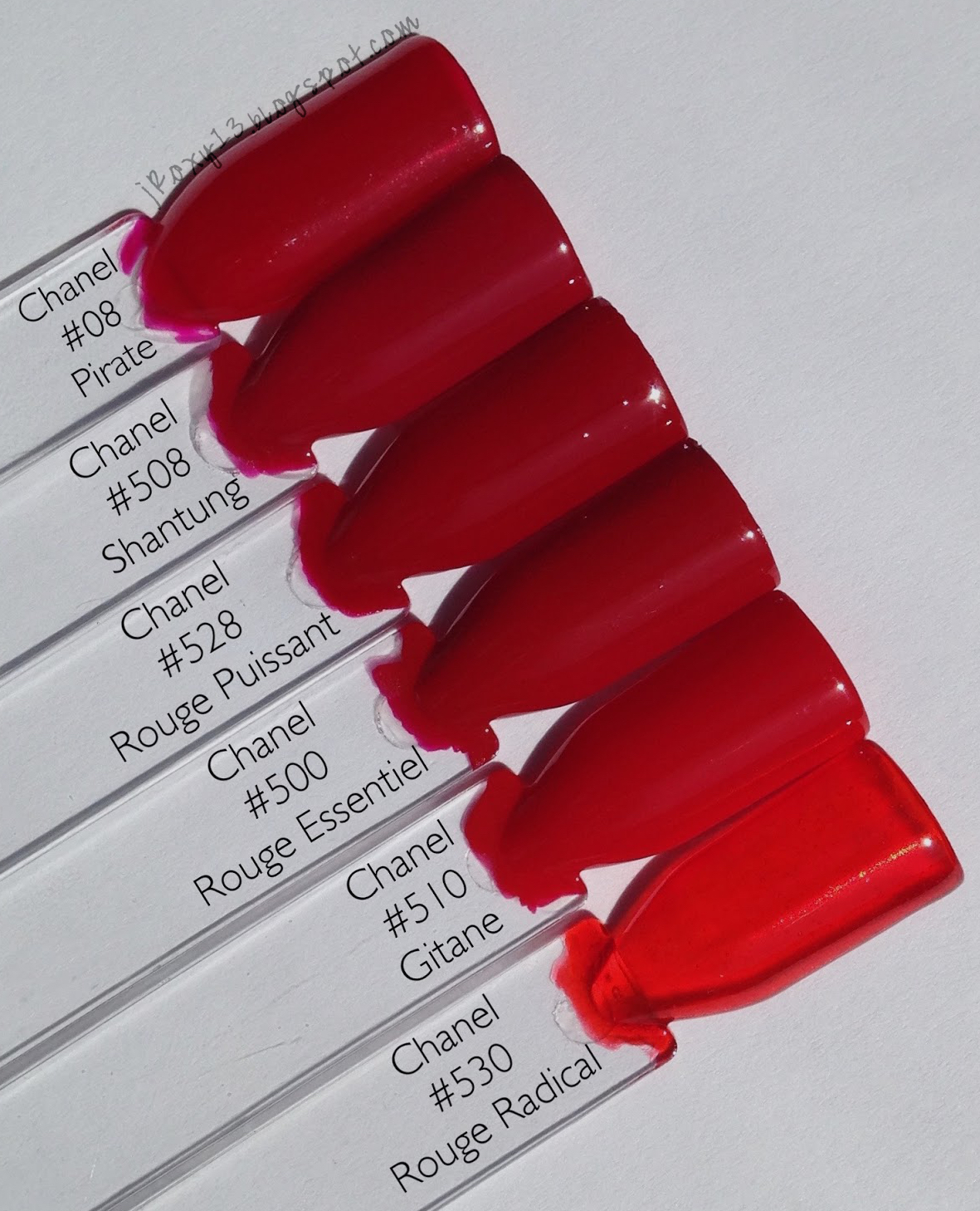

This is Chanel's current lineup of reds (only Rouge Radical is limited edition). My version of #08 Pirate is from the old Le Vernis line; it is a cool red jelly that's a close dupe for OPI in Vodka & Caviar. #508 Shantung is a slightly pink-toned red creme. It's hard to tell from these pictures, but Rouge Puissant is significantly deeper. #500 Rouge Essentiel is the same depth as Shantung but is a slightly brick red creme. #510 Gitane is a bright tomato red creme. #530 Rouge Radical is a bright orange-red jelly.
 |
| Direct sunlight |
 |
| Indirect natural light |
#530 Rouge Radical is a bright red-orange jelly. Given how much you can see the brush in the bottle, I thought this would be very sheer, but it built up well in 2 medium coats. You could barely see my nail line, but on my swatch stick I added a third coat, and it didn't deepen the opacity at all, so I think those with longer nails will see some free edge through this one. The formula flowed really nicely for a jelly - it wasn't thick or goopy, and it self-leveled well. I used a base coat and got no staining. I did get some bubbling, but this happens for me with all jellies, so I don't think it's an issue with the formula, just my body chemistry.


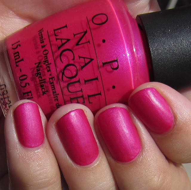
Deborah Lippmann in Supermodel (layered here) is a more opaque dupe for Rouge Radical. I think you can see this a bit in the shade photo, but I also included bottle pictures below comparing the two. You can see the brush is barely visible in the DL bottle compared to Chanel's. Supermodel seems to be discontinued, but it's still available on Beauty.com (which will be shuttered by end of September). #717 Coquelicot is a slightly deeper creme version of Rouge Radical.

For reference, here are bottle pictures of the current Chanel red lineup (again, my bottle of Pirate is the old formula).

And, here are bottle pictures of the most similar polishes from Chanel past and present that I own. The label-forward bottles are the new formula (the old bottles have a sticker label on the front, which distorted the true color a bit for comparison). I'm showing #487 Rouge Fatal, #08 Pirate, #508 Shantung, #528 Rouge Puissant, #500 Rouge Essentiel, #510 Gitane, #530 Rouge Radical, #534 Espadrilles (swatches and comparisons here), #455 Lotus Rouge, #71 Laque Rouge, #475 Dragon, #677 Rouge Rubis, #38 Rouge Flamboyant, #687 Phenix, #717 Coquelicot, and #473 Coromandel (swatches and comparisons here). The shade picture gives a better idea of the differences, but they are even more apparent in person - it's so aggravating that I couldn't capture them better!


These polishes have also been posted by Eugenia on Ommorphia Beauty Bar for additional swatches.
So here, in case you're interested, is a bit more on Lucia Pica. she is a makeup artist who has worked under Charlotte Tilbury, and has a history with Chanel Beauty campaigns (she did makeup for the Fall 2014 "États Poétiques" collection, Fall 2014 "Rouge Allure Gloss" collection, and Holiday 2014 "Plumes Précieuses" collection and has done makeup for Keira Knightley). You can see more of her portfolio here, and she is on Instagram. Of her style, she says, "I often talk about deconstructed glamour. I do want to look glamorous, and I do want to look polished, but there's a modernity that comes with being relaxed about the way you look. Relaxed in terms of texture and in terms of application. Yes to beautiful skin -- add coverage, but not too much. Your makeup should look like it's part of you" (Manrepeller.com interview). Talking about the direction she wants to take Chanel in, she mentions bold pops of color and has mood boards with references ranging from "Art Deco postcards, images of Brutalist architecture, a snap of an edgy young girl spotted in an L.A. nightclub, a series of Polaroids of single-stem flowers pulled from the vast congratulatory bouquets she received when news broker of her appointment, and a handwritten note from an ex-boyfriend" (Vogue profile). In her Vogue interview she emphasized, ""I want the lineup to be modern and very straightforward. I want it to be super now, precise, and strong." You can see a bit of her at work on Youtube.
Of her inspiration for this fall collection, Pica added, "I am obsessed with the colour red, I always have been. There is strength and motion, warmth and disruption in red. It is a colour that has both a sense of the real and the radical about it. Red is so strong for me and yet it is also intrinsic to the world of CHANEL." She also put together an inspiration, which can be seen below:
The London presentation of the collection featured more of her inspiration visuals on the walls, which can be seen here and here. More can be found on Instagram; here is a selection:
From an aesthetic point of view, I find Pica's style really lovely. But, I'm not sure I'm picking up what she's putting down in the nail polish department. The interstitial between Fall and Holiday 2016, seems to be "Libre 2016 Synthetic de Chanel" (apologies, this is what I'm gathering from my faulty Russian translation). You can see product shots on @kavalerievna's Instagram page. From the looks of it, we're getting a pink creme (possibly with a satin finish?), a pink shimmery jelly, and a silver metallic. 😕
Here are preview swatches:
It's honestly not blowing my socks off. But, what do you think? Are you excited by this new direction for Chanel? Do these reds seem special enough for you to pick up? I hope you all are having a great summer and enjoying the Olympics!

Very thorough review, beautiful pics and swatches. Loved that you showed a dupe for the Chanel 530 . They look nearly identical.. too bad the DL is also discontinued as well.
ReplyDeleteGreat reading your poost
ReplyDelete