
Happy Valentine's Day: Organize · Resist · Protect | Tom Ford in #04 Bitter Bitch + Comparisons

So, I started with this polish as a post-election mani. I went through it all with this post. All the things. All the links. All the articles. All the yells. All the swears. All the cries. We've gone through a lot since then. And where have we landed? We're two months in. Four months since women realized that no, we are still not equal, that feminism is still a dirty word to far more than half of the electoral map. Five months since we learned that sexual assault - although we already knew it could not keep our athletes or entertainers from their careers - was no longer a hinderance to attaining the nation's highest office. It's been months. We've gotten through it. Denial. Anger. Bargaining. Depression. Acceptance.
Acceptance? No. NO. Never. NO.
Happy Valentine's Day. Here's to all you Nasty Women. Go out and love yourself, love the people around you, love the people that truly make this country great. Do something nice for them or yourself. #Grabyourwallet, donate (suggestions can be found here, here, here, here, and here), and/or support real news by subscribing to journalism. It matters. You matter. Love has to win, right? It will in the end, right? Fuck YEAH it will if we have anything to say about it, RIGHT?!
Oh, you wanted to know about this dumb polish?
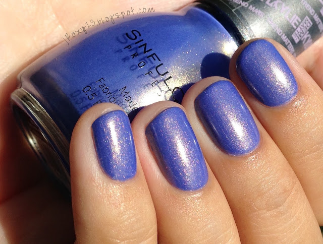
This is Tom Ford in Bitter Bitch. I bought this years ago purely for the name because I knew there would be a day when it would not suit me only partly but totally and completely. And, oh boy, did that day come. This is part of Tom Ford's initial collection launch in Winter 2011, and I can't say that there's much to recommend it except for the name. I used 3 thin coats. You could definitely do 2 thicker coats, and probably get away with 2 thinner coats but my hands were a little shaky the night I did this mani, so I had some bald spots I needed to go over.

 |
| Direct sunlight |
Bitter Bitch is a deep reddish brown creme. It's a pretty color, but the formula isn't exceptional, and it dulls down really quickly. Every time I looked at my nails I pretty much wished I was wearing Chanel in Diabolic (but also, maybe you guys are getting this, but I was in a fucking foul mood at this time).
The Tom Ford brush also felt a little floppier than I prefer. It wasn't a mop, but for a deep color like this, I like my brush to be a little more soldierly. The square cap pulls off, but I also didn't like the cap underneath. I've compared it to two different caps I prefer below. The Chanel cap is the same length as TF but wider and only one width, which makes it easy for my fingers to grip and maneuver. The Illamasqua is longer than the TF and also has two widths, but gives room at both levels for your fingers to rest, so you can grip it like you would a pen or pencil. Because the TF cap has such a shallow top level on the cap, I felt a lack of control when holding it, which combined with the slightly less stiff brush made application a mediocre experience.

The over cap is also not made so that is slots perfectly evenly with the planes of the bottle. You can see the differences in comparison with the Chanel and Illamasqua caps. Keep in mind that this is an old bottle of Tom Ford; perhaps the design has been revamped since 2011. The Chanel over cap has panels so that the cap automatically clicks into place - there is no way you can put the cap on so that it lies unevenly with the planes of the bottle. The llamasqua over cap has ridges that interlock with the ridges on the brush cap, so even if the over cap is uneven with the plane of the bottle, you can twist the cap until it is even. The Tom Ford over cap has four ridges at 90 degrees (they are very hard to see), and it doesn't always result in the cap lining up correctly with the bottle. For a bottle that's more expensive than Chanel and far less collectible, not very impressive. The bottle is glass though, and weighty, which is more than you can say for the Burberry bottles. However, I won't buy any more Tom Ford unless the color is spectacular.


 |
| Indirect natural light |


Apologies, I couldn't get super sharp pictures for my comparison shots. Deborah Lippmann in Maneater is deeper and a jelly finish. Chanel in #437 Forbidden is a bit lighter with more purple. Chanel in #469 Imperial is lighter with a bit more purple. MAC in Rich, Dark, Delicious is a cooler brown. By the way, since I mentioned Diabolic earlier, it is much more red and more vampy (deeper).
Finally, this Valentine's Day there are many events as part of #RevolutionaryLove:
"Love is not just a feeling but an action. Love is the commitment to extend our will for the flourishing of others, opponents, and ourselves. When we love even in the face of fear and rage, we can transform a relationship, a culture, and a country. Love becomes revolutionary. The way we make change is just as important as the change we make. In this dangerous new era, Revolutionary Love is the call of our times."
-- Valarie Kaur, Sikh American civil rights activist, Founder of the Revolutionary Love ProjectTo learn more and find events you can go here.

Comments
Post a Comment