
Chanel in #566 Washed Denim, #568 Tulle, #570 Androgyne, and #572 Emblématique Swatches + Comparisons | Spring 2017 "Rouge Coco Gloss" Collection

The most interesting of Chanel's spring collections this year is the "Rouge Coco Gloss" collection. I don't know that these really fit into the Rouge Coco Gloss (which replaces Glossimers) theme, but there were some colors that intrigued me and they all seemed like a good addition to the permanent line (Tulle is the only limited edition polish in this collection). Was I more impressed or disappointed by this collection? Let's find out!


 |
| Direct sunlight |


 |
| Indirect natural light |
I have a few comparisons to help give you context when looking through your stash for a possible match. Nothing I found was close.


Here are the closest greens I found. Rescue Beauty Lounge in Diddy Mow (shimmer), which is a close dupe for Essie in #731 Sew Psyched, is much deeper, more green, and has white shimmer. Deborah Lippmann in Desert Moon (creme) is a bit deeper and more green. Formula X in Fearless (creme) is lighter and more green.


Here it is compared with my light blues. Essie in #683 Sag Harbor (shimmer) is lighter, more blue, and has white shimmer. China Glaze in Sea Spray (shimmer) is much lighter, more blue, and has white shimmer. American Apparel in Redondo Beach (jelly) is much much much more blue.


Rescue Beauty Lounge in Stormy (creme) is one of my bluest greys, so I thought it would be helpful to include. MAC in Blue India (creme) is deeper and brighter. Chanel in Blue Boy (creme) is deeper, brighter, and more blue.
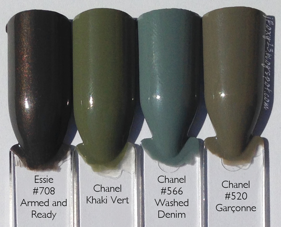
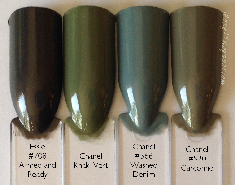


Finally, the olives. Essie in #708 Armed and Ready (shimmer) is very clearly different, but it does have a slight dustiness to it, so I wanted to include it. Chanel in Khaki Vert (creme) is much warmer and more green. Chanel in #520 Garçonne (creme) is a grey-green-taupe - very different.


 |
| Direct sunlight |
#568 Tulle is rightfully a limited-edition because no one wants a fussy formula in their permanent line. I did 3 thin coats, and I really had to float the brush to prevent cuticle drag and ridges. This is a peach creme. It is a nice color, but it's nothing to write home about. It really reminded me of Essie in #16 Cantaloupe when I put it on, but it's not a dupe.

 |
| Indirect natural light |


Chanel in #539 June (creme) has a similar softness to Tulle, but is darker and much more orange. Essie in #16 Cantaloupe (crelly) is deeper and more "juicy" looking because of its finish. Chanel in #515 Pêche Nacrée (shimmer) is a bit lighter and more orange and has white pearl. Chanel in #569 Emprise (creme) is lighter, a bit more orange, and much starker. Maybelline Express Finish in #615 Sweetie Pie (creme) is lighter and a bit more pink. American Apparel in Summerland Beach (jelly) is more pink.


 |
| Direct sunlight |
#570 Androgyne was absolutely the biggest disappointment of the collection. It's very reminiscent of #563 Vertigo because its subtle shimmer will never come out to play. Even if you look closely in full light, it is barely visible. Even when I could angle the bottle to show a ton of shimmer, I could never find even the most awkward positioning of my hands that made it show. Androgyne could have been a very cool polish - and Chanel hasn't had a really stand out polish since when - maybe #675 Troublante? So they sorely need to reinvigorate this line. But Androgyne will not be the one to do it. It is a deep brown with purple and has green subtle shimmer. THAT YOU WILL NEVER SEE. I tried layering polishes over to bring it out: nope. (A very thin layer of Pure Ice in Heartbreaker might actually work, but I've misplaced mine.) I tried to sponge on an extra coat, theorizing that the base would sink into the sponge and the shimmer would stay on the surface and transfer more visibly to the nail: FAIL. I used 2 thin coats. This polish also tended to look dull even with top coat. Not cool, Androgyne. Not cool. These next two pictures are the absolute most shimmer you will ever see on the nail.

 |
| Direct sunlight |


 |
| Indirect natural light |


None of these polishes is an exact match, but they look so similar from a normal distance that I don't think you need more than one. Sally Hansen Complete Salon Manicure in Bittersweet (creme) is warmer. Chanel in #563 Vertigo (creme) has less purple and is a bit more greyed out; there's also red, purple, and gold subtle shimmer that is pretty much invisible. MAC in Rich, Dark, Delicious (creme) is very similar to Androgyne, it just has less purple.

 |
| Direct sunlight |
#572 Emblématique (which means "iconic") turned out to be my second favorite of this collection. But then, it's no surprise that Chanel does reds well. This is a deep red crelly with a cool undertone. It actually looks quite deep in lower lighting. I used 3 thin coats, but it would be great in 2 medium ones.


 |
| Indirect natural light |
 |
| Indoors - shade |
 |
| Artificial light - night |


Chanel in #455 Lotus Rouge (creme) is deeper. Chanel in #71 Laque Rouge (creme) is brighter and a bit warmer. Chanel in #08 Pirate (jelly) is much lighter and a bit warmer. Orgasm in In Your Dreams (jelly) and OPI in Got the Blues for Red (jelly) are dupes, I just added an extra layer to the OPI. They are very close to Emblématique, but a bit cooler.
Any hits for your from this collection? Are you, like me, still waiting for a truly exciting Le Vernis launch since Lucia Pica took over?

Comments
Post a Comment